BNY LEX — Fix Cash Break
Every Morning, Someone Opened a Spreadsheet to Find Out What Broke Overnight.
At BNY, cash breaks happen every day. When a transaction settles late, when a dividend posts to the wrong account, when two systems calculate a cash position differently — the result is a break. A number that doesn't match.
The operations teams responsible for fixing those breaks were spending hours each day in spreadsheets, manually tracing each discrepancy back to its source. The process was entirely manual, error-prone, and invisible to portfolio managers who needed to know whether their cash positions were accurate before making allocation decisions.
The existing tooling showed you the break. It didn't help you fix it.
For an institution managing custody accounts at BNY's scale, even small cash discrepancies compound quickly. A break that sits unresolved for 24 hours isn't just an accounting problem — it's a potential compliance issue, a client trust issue, and in some cases, a settlement risk.
The operations team had grown to handle the volume through sheer headcount. Adding more people wasn't a solution — it was an acknowledgment that the process was broken.
Leadership needed a tool that could surface the right breaks to the right people at the right time, and help them resolve faster.
I led UX design across the engagement — responsible for research, systems mapping, and interaction design. The project had a dual scope from the beginning: a global cash break view for operations supervisors, and a portfolio-level view for analysts. Two different user types with two fundamentally different needs.
The research phase was heavy. Cash break resolution isn't intuitive domain knowledge — I had to learn the operational workflows from the inside, sitting with analysts through their morning routines, before I could design for them.
My starting point wasn't screens. It was the shape of the system. Where did cash breaks originate? How were they discovered? Who was responsible for each type? What did resolution actually look like — step by step — for different break categories?
The mapping covered the full lifecycle: where breaks originated (settlement failures, late postings, calculation discrepancies), how they were discovered (overnight batch jobs, morning reconciliation), who owned each type, and what resolution actually looked like step by step. That work took two weeks. The interface design took considerably less time, because the system was already understood.
What the mapping revealed was that "fixing a cash break" wasn't one action — it was three or four, depending on the break type. And the existing workflow treated all of them the same way, which meant analysts were applying the same investigation pattern to problems with completely different root causes.
Once I could see the system, the interface path became clearer: breaks needed to be categorized by type and routed to the right resolution workflow, not dumped into a single undifferentiated queue.
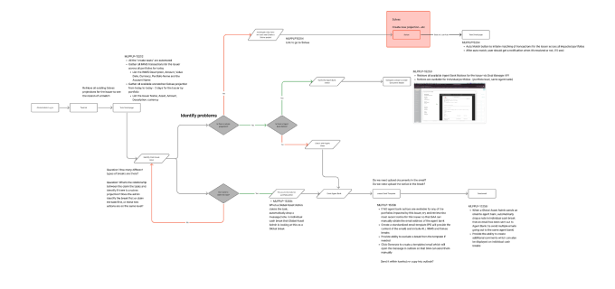 System map — cash break lifecycle from origin through discovery, routing, and resolution
The global view was designed for operations supervisors — people who needed to see the full landscape of breaks across all portfolios and triage escalation. The core design challenge was information density: they needed everything at a glance without being paralyzed by it.
The solution was a tiered dashboard. Summary KPIs at the top — total break count, total value at risk, aging flags for breaks past threshold. A filterable table below, sortable by age, value, business unit, and resolution status. Color-coded severity so the most urgent items surfaced immediately without requiring a filter interaction.
The design principle throughout was: don't make supervisors hunt. If it's on fire, it should look like it's on fire.
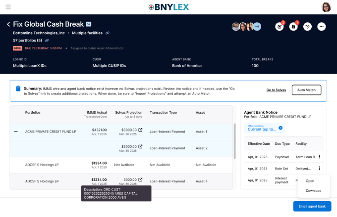 Global Cash Break — supervisor view with KPI strip, severity-coded table, and AI-generated summary
The portfolio view was designed for analysts — people who needed to dig into specific breaks, understand the contributing transactions, and reconcile them. Where the global view was about triage, the portfolio view was about resolution.
The core problem at this level: analysts were manually reviewing transaction histories to find the trade or event that explained each break. For complex portfolios, that investigation could take 30–45 minutes per break — and there were dozens of breaks to clear each morning.
The AI matching feature automated that investigation. Given a cash break, the system surfaced the most likely matching transactions — ranked by confidence, with a plain-language explanation of why each one was flagged. An analyst who previously spent 40 minutes tracing a break could now review three ranked suggestions and confirm in under five.
The hardest design question wasn't technical — it was trust. How do you present AI-generated suggestions in a context where an analyst needs to be confident before taking action on a client account? A suggestion that turns out to be wrong doesn't just waste time — it erodes the entire tool's credibility.
The answer was transparency at every layer. Every suggestion showed its reasoning. Every confidence score had a tooltip explaining what drove it. The analyst always had one-click override and a clear path to manual investigation if the suggestions didn't feel right.
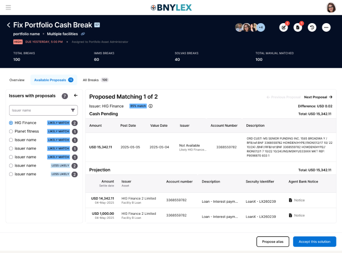 Portfolio Cash Break — AI matching panel with confidence-ranked suggestions and one-click resolution path
Analysts who previously spent 30–45 minutes tracing a single portfolio-level break were resolving high-confidence AI matches in under five. The overall resolution time for AI-applicable breaks dropped substantially — and the global view gave operations supervisors the visibility they'd been asking for — a single place to see the full picture without building a pivot table every morning.
The AI matching feature moved from pilot to core feature in the subsequent sprint cycle. It was one of the clearest demonstrations on the engagement that AI augmentation in financial operations isn't about replacing analyst judgment — it's about eliminating the part of the job that's pure manual search.
Operational tools for financial services live or die on trust. A dashboard that shows the wrong number — even once — loses its users permanently. Every design decision had to be made in service of accuracy and legibility, not elegance.
The AI matching work taught me something specific: the interface has to earn trust before it can delegate work. Users won't follow a suggestion they don't understand, even if it's right 90% of the time. Making the reasoning visible wasn't a nice-to-have — it was the product.
“The interface has to earn trust before it can delegate work.”