FedEx CFO Financial Performance Dashboard
Nobody Could See the Whole Picture.
FedEx's CFO office needed a better way to see financial performance — not just revenue numbers, but the story behind the numbers. Teams across finance, operations, and executive leadership were all pulling data from different systems, building their own reports, and arriving at meetings with different versions of the truth.
The CFO needed a single source of truth. Something that showed performance at a glance, let analysts drill down into the drivers, and gave executives confidence that everyone was looking at the same data at the same time.
The tool didn't exist. They were building it from scratch.
This wasn't a nice-to-have dashboard. FedEx's CFO was using this to brief the board. The numbers had to be right, the hierarchy had to make sense, and the interface had to be fast enough that executives could navigate it live in a meeting without hunting for information.
The underlying data was messy — different business units reported in different structures, and some metrics were calculated differently depending on who you asked. Part of my job was to figure out what the dashboard should say before figuring out what it should look like.
We had about six weeks before the first stakeholder review.
I came in as the lead UX designer, working alongside a product manager and a team of data engineers and FedEx finance stakeholders. My responsibilities spanned research, information architecture, and interaction design — from initial stakeholder workshops through final handoff.
The hardest part wasn't designing the interface. It was establishing a shared vocabulary. What does "on track" mean? Who defines a variance threshold? How do we show comparison periods without misleading the reader? These were design problems that looked like data problems.
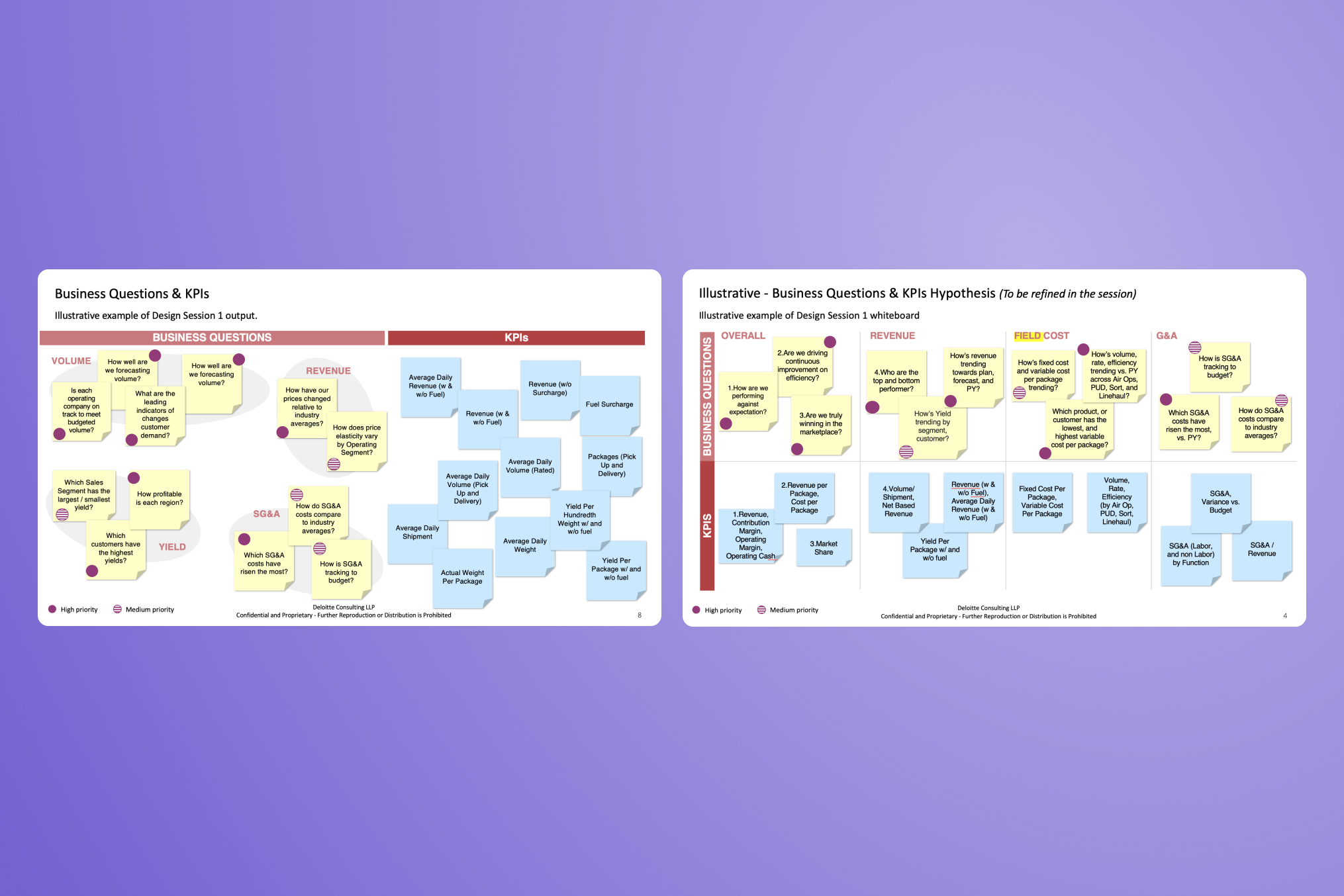 Business Questions & KPIs — design session output mapping financial metrics by stakeholder priority
My starting point wasn't screens. It was structure. Before I opened a design tool, I spent the first few weeks building an information architecture for the dashboard — mapping out every metric that needed to live there, how they related to each other, and which ones executives actually cared about versus which ones analysts needed for drill-down.
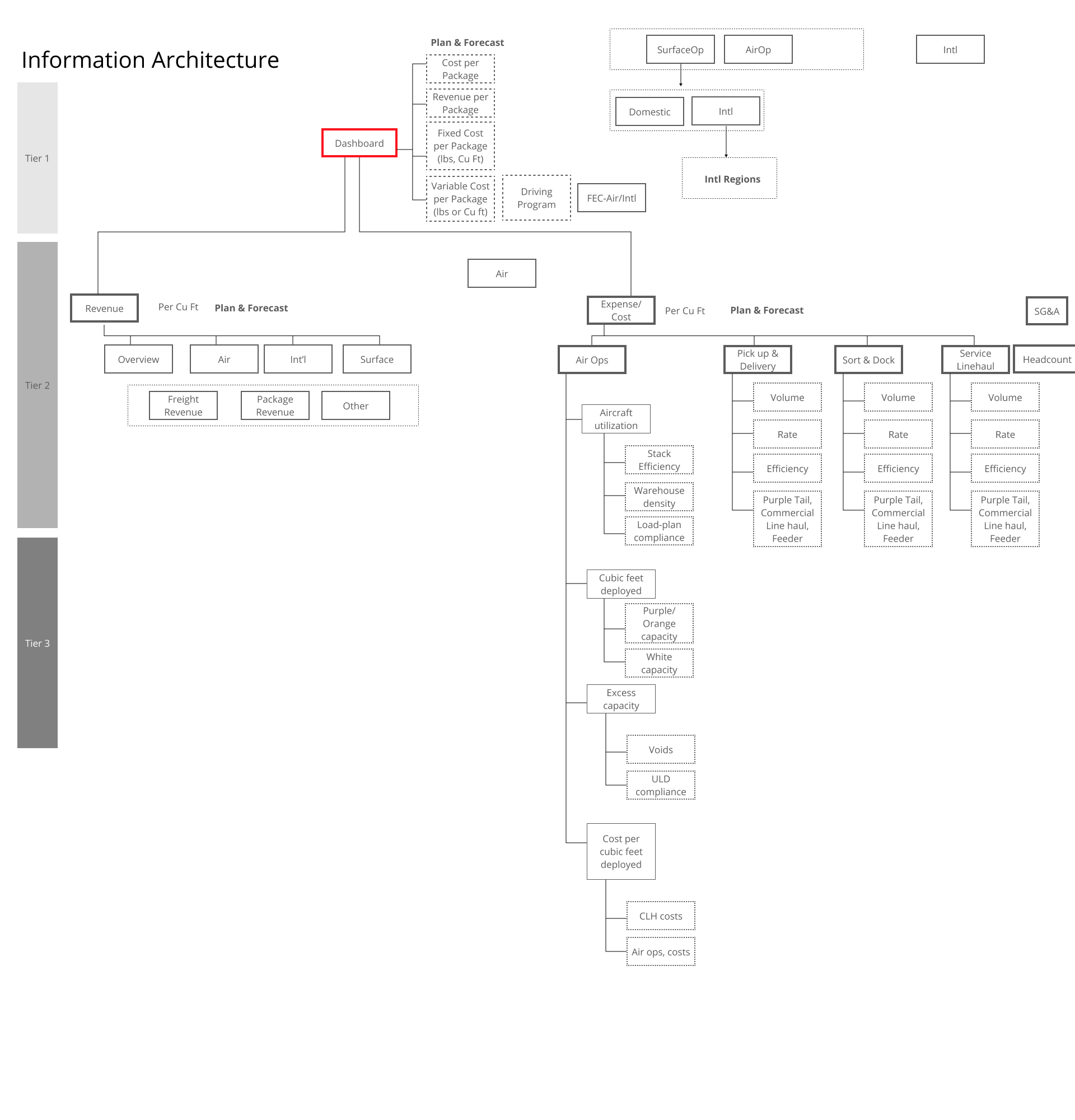 Information Architecture — metric hierarchy and cross-functional relationships across the FedEx financial platform
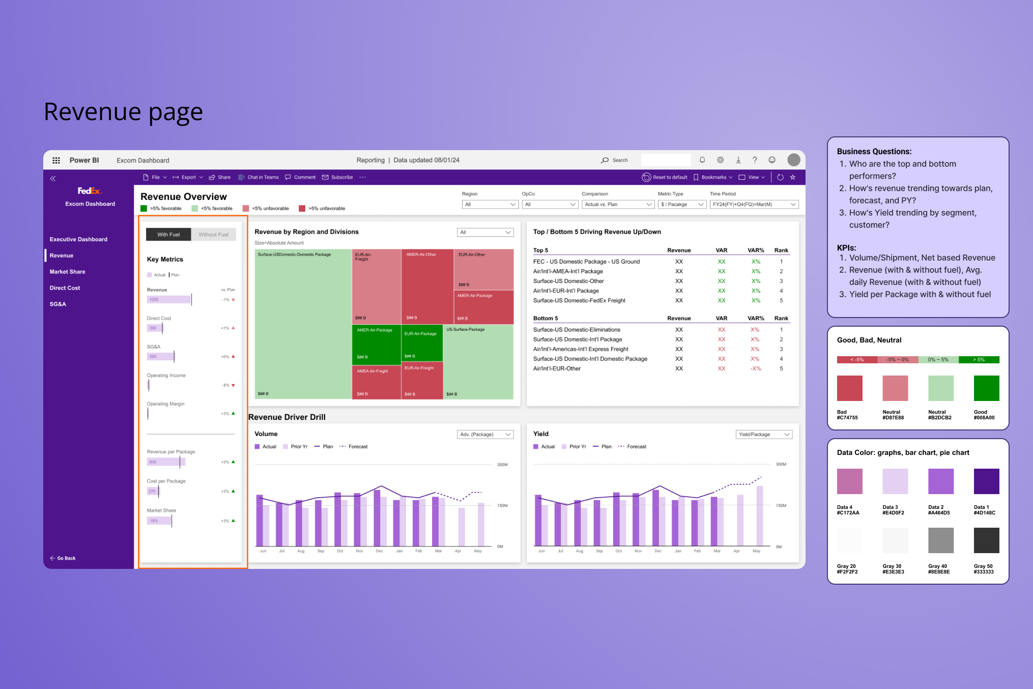
From there, I worked backward. Once I knew what the hierarchy was, the layout questions answered themselves. What goes at the top of the page? Whatever has the highest executive scan priority. What can be hidden behind a filter? Whatever is analyst-specific.
The design challenge was compression: how do you show a complete picture of financial performance without overwhelming the person reading it? The answer was progressive disclosure — summary at the top, detail on demand, drilldown on click.
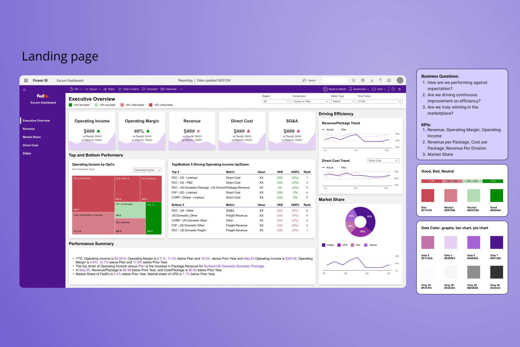
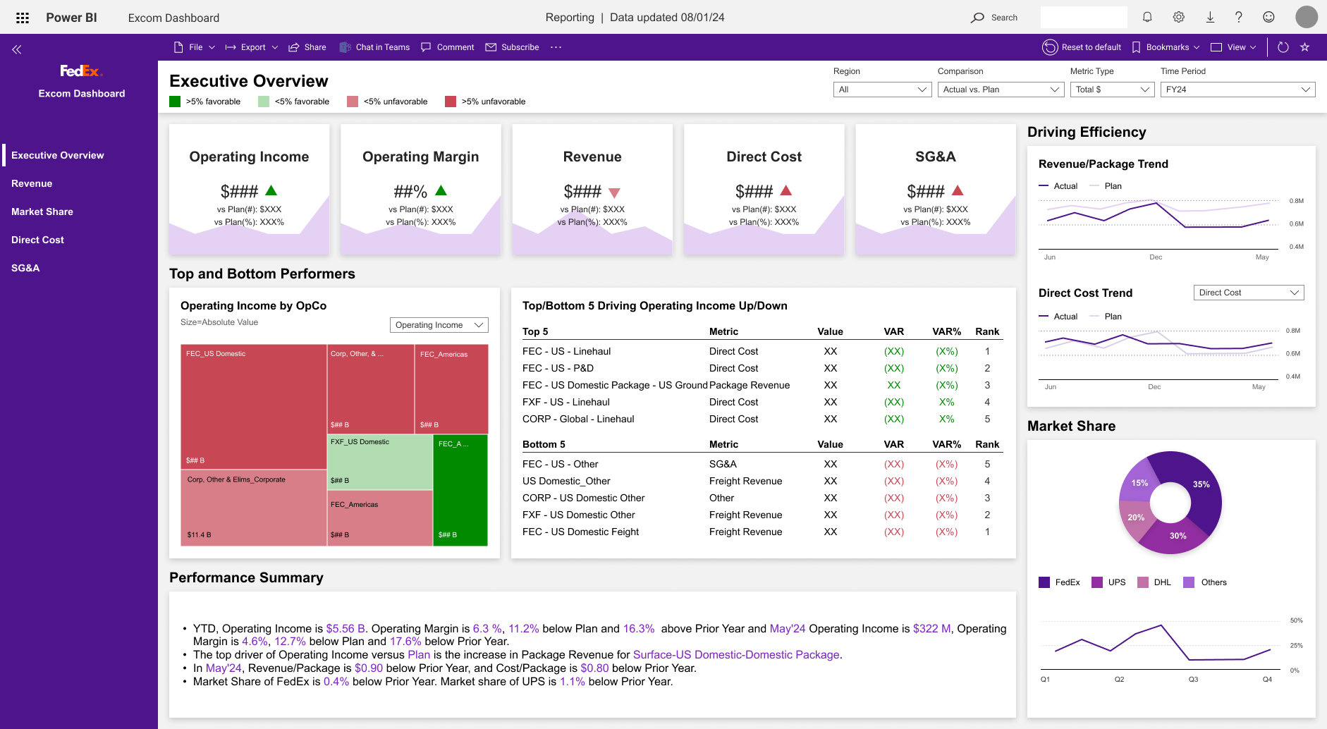
The final dashboard had three layers. An executive summary at the top — key performance indicators at a glance, with variance indicators that immediately flagged what was off-plan. A performance detail layer below — filterable by business unit, time period, or metric category. And a drill-down surface — accessible from any KPI card, showing the underlying data and its methodology.
Every design decision was in service of one thing: reducing the cognitive load for someone who has 90 seconds to scan a page and three questions in their head before they walk into a boardroom.
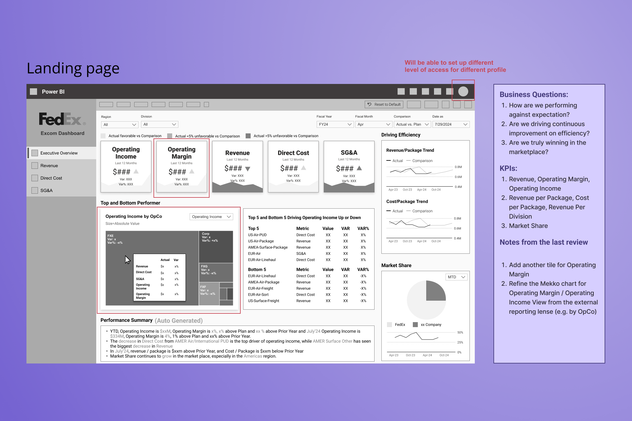 Landing Page wireframe — KPI hierarchy and layout structure with annotated executive scan priorities
One feature shaped the experience beyond layout: a GenAI-powered performance summary that generated a plain-language narrative of the data before executives examined the metrics. The rationale wasn’t novelty — it was cognitive entry. Walking into a boardroom with a pre-read of what the numbers say, in natural language, changes how an executive engages with the detail. We validated the summaries with FedEx’s finance team to confirm accuracy and tone before launch, and positioned them as an orientation layer rather than a replacement for analysis.
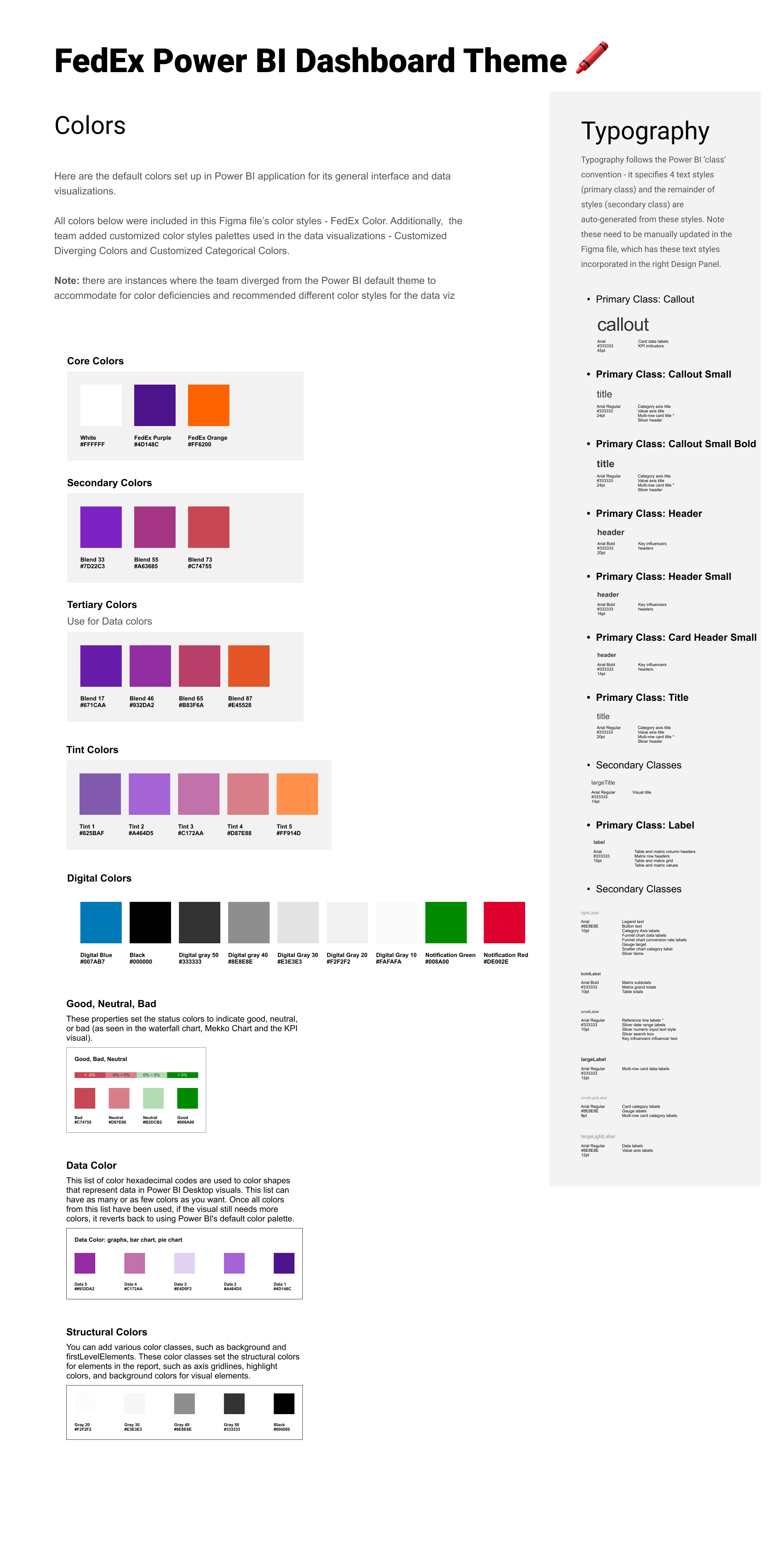 Design System — FedEx color palette, data visualization color conventions, and typography hierarchy
Stakeholders reported 30–50% faster executive review cycles after launch. Finance teams that previously spent hours identifying anomalies were finding them in minutes.
The dashboard launched in time for the first board briefing. The CFO's team used it live — no slides, no exports, just the interface — to walk through quarterly performance. The response from leadership was that it was the first time they'd seen a complete financial picture without having to ask follow-up questions.
Post-launch, the tool was expanded from CFO use to broader finance leadership. What started as a single executive dashboard became the foundation for a wider financial data platform across the organization.
Data visualization is mostly a language problem. The hardest design decisions weren't visual — they were semantic. What does this metric mean? How do we label it consistently? When does a variance become a flag versus a note? Getting those answers required stakeholder alignment, not design talent.
Executive audiences read differently. They don't scan — they triangulate. They jump to the outlier, then look for context, then check methodology. Designing for that reading pattern is a completely different problem than designing for a user who's exploring.
“The first time they'd seen a complete financial picture without having to ask follow-up questions.”