Luma
Every other tool organizes your job search. Luma advises it.
Job searching at the senior level is cognitive overload. Dozens of applications, no signal on which ones are worth your time, no one to tell you honestly whether your resume matches the role. You apply into silence and wait.
Existing tools — Teal, Huntr, Simplify — are sophisticated spreadsheets. They track applications through stages, surface some job listings, maybe help you format a resume. But they don’t think. They don’t evaluate. They don’t tell you that this specific role is a strong match on product scope but expects 3+ years of B2B SaaS and your background skews consumer, so you need to address that directly in your cover letter.
No tool combines discovery + fit analysis + resume tailoring + pipeline tracking in one place, with an AI that actually knows your background. That gap was the product.
The insight that drove everything: the user doesn’t need a better tracker. They need someone in their corner. An advisor who read their resume this morning, knows their goals, and can tell them which jobs are worth sending it to — and why.
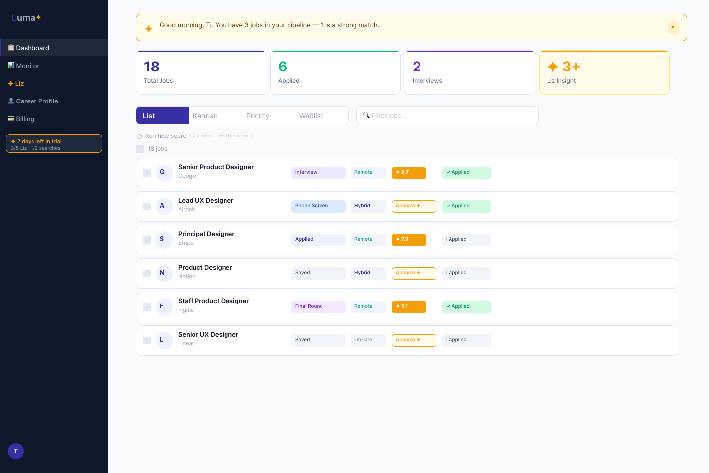
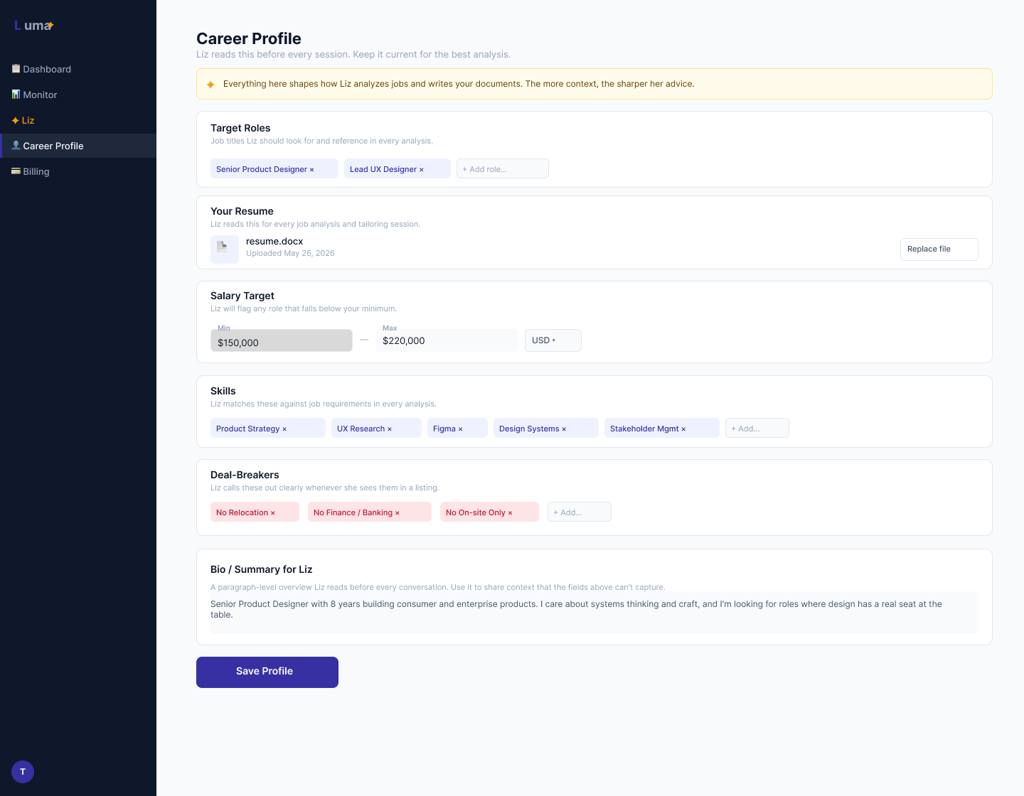
That’s Liz. An AI career advisor persona built on Anthropic Claude who knows the user’s resume, career history, and target roles. She can score a job against your background, explain exactly what’s strong and what’s a gap, rewrite your resume to close those gaps, draft a cover letter, and prep you for the interview. Every output is specific to you and the role. Nothing is generic.
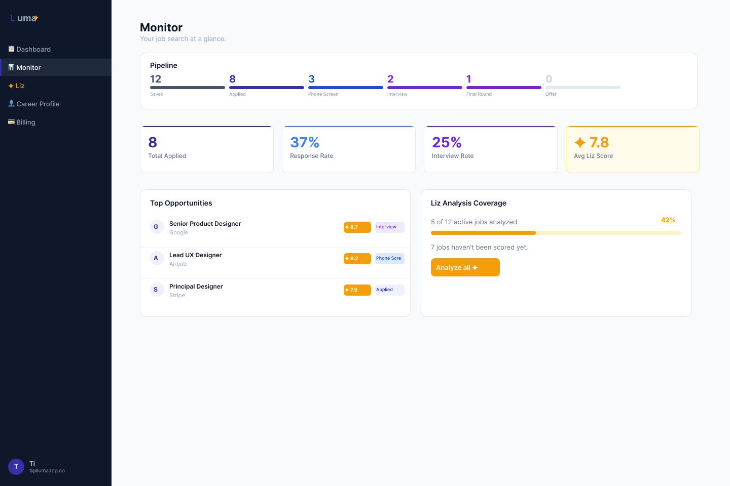
The feature set: job discovery via JSearch API with multi-query and auto-scoring, a 9-stage pipeline dashboard, the Liz advisor panel (fit analysis, resume tailoring, cover letter, interview prep, all streaming), a 5-step onboarding wizard, Stripe billing, and a trial + persona gating system. Full stack: Python/Flask backend, Tailwind CSS, Jinja2 templates, vanilla JS + SSE streaming, SQLite migrated to Supabase PostgreSQL, Railway deployment.
The business model is $19/month with a 7-day free trial — no credit card required. Competitors charge $29–$50/month. The differentiator isn’t the price. It’s Liz.
This is the section that makes this case study different from every other project in this portfolio. I didn’t hand off to a developer. I built the product myself using Claude Code — acting as product manager, designer, and builder simultaneously across six sprints in three weeks.
What building with Claude Code actually looked like in practice: I wrote the PRD and sprint plans in Notion, then prompted Claude Code to implement each feature. I reviewed every output — not just “does it run” but reading the logic. I established a deliberate “code study plan” alongside development: reading sessions focused on understanding the code Claude Code had written, not just shipping it.
That practice found 10 real bugs across sprints. Three were critical:
- A remote filter bug that silently dropped all non-remote job results — meaning the default view was hiding most of the data
- PDF resume uploads crashing the Liz analysis flow entirely
- A hardcoded
SECRET_KEYdefault that would have shipped to production
Building with Claude Code is a design problem. What you get back depends on how clearly you define the context, how precisely you specify constraints, and how rigorously you review the output. The CLAUDE.md file I maintained for each agent session, and the AGENT_LOG.md shared across the team, were themselves design artifacts — context infrastructure that made each session start from a complete picture instead of a blank slate.
The discipline required to think clearly before prompting is the same discipline required to think clearly before designing. It’s just a much faster feedback loop.
Building with Claude Code is one thing. Understanding what it built is another. Early in the project I realized I was directing development I couldn't fully evaluate — approving features, reviewing outputs, shipping code I didn’t comprehend. That’s a design problem. You can’t make good product decisions about systems you don’t understand.
So I built a parallel practice: a 16-week code literacy plan, 20–30 minutes a day, structured like a curriculum and calibrated to my actual schedule and goals. Not writing code. Reading it. The method was specific: open a real file, find every word that repeats three or more times, notice patterns before looking anything up. Ask Claude questions, not for answers but for options. No ambiguous responses — present the tradeoffs clearly, honest about what I could and couldn’t do yet, so I could make real architecture decisions in areas where I lacked expertise.
The sessions taught me something about what a good AI advisor actually does. It doesn’t overwhelm you with what it knows. It gives you exactly the right next step. Every session ended with a specific question answered and a new one opened — which is how real learning compounds.
Four things the study sessions surfaced that changed how I think about the product:
Security gaps hide in plain sight
Day 1. The exercise was simple: find every word that repeats three or more times in a file, without looking anything up. By the end I’d spotted a real security gap in my own codebase — a hardcoded SECRET_KEY default that would have shipped to production. Not because I’m a developer. Because I finally slowed down and looked.
The codebase knows your browsing history
Day 3. I spent the first 20 minutes trying to find the folder — wrong drive, wrong syntax, a folder name with a space in it that broke everything. The AI advisor corrected each mistake and explained exactly why it happened. By the end I had the folder map. I’d also discovered my Chrome browser history was sitting inside the codebase, about to be uploaded to GitHub.
The moat isn’t the model
Day 4. I found the line that runs Liz: import anthropic. That’s the line that calls the AI. Liz isn’t the intelligence — she’s the persona, the logic, the prompts. The thinking comes from an API my product depends on but doesn’t control. That used to sound scary. Now it sounds like every good business: build on the best available foundation and focus your energy on what only you can build. The UX. The workflow. The honesty Liz is designed to have.
Bugs found by reading, not testing
Day 6. I was tracing how a nav button connects through HTML, CSS, and Python. One layer led to another and I ended up in the route that handles what users see when they first land on the app. Logged-out users were hitting the dashboard — not a landing page, the dashboard, just empty. I didn’t write a single line of code to find it. I wrote up the fix for the dev agent: remove the dashboard from the public whitelist, add a landing route, hook up the onboarding check. Clean handoff, no ambiguity. A week earlier I couldn’t have told you what a route was.
The study plan is still running. What it keeps confirming: the more precisely you can describe what a system is doing, the better your product decisions get. Storage, memory, safety, load time — these aren’t engineering concerns. They’re design constraints. You just have to learn to see them.
Liz is the product’s core value. Designing her meant making decisions at every layer: visual identity, behavioral scope, conversational tone, and the moment the product asks you to pay. Each decision was explicit, not defaulted to.
Amber everywhere. Liz’s nav item, score badges, insight cards, and chat bubbles all use amber (#F59E0B). One color creates an instant visual association with her presence anywhere in the UI. When you see amber, Liz is speaking. This was locked in Sprint 4 and applied retroactively across all screens.
Scope rules written explicitly. Liz is constrained to career advice. I wrote the constraint into her system prompt: “Career advice only. Every score must be explained — not ‘7.2’ but ‘Strong match on product scope, but they want 3+ years B2B SaaS and your background skews consumer.’ Redirect warmly when out of scope.” A score without explanation is just a number. Liz doesn’t give just numbers.
The context bar. On the advisor page, Liz always shows what she knows: “Liz knows you, [Name] · [Current Role] · Resume on file · 12/14 profile fields complete.” She never acts like a stranger. The context bar was a Sprint 2 decision and remained unchanged through Sprint 6 — it tested immediately as the right call.
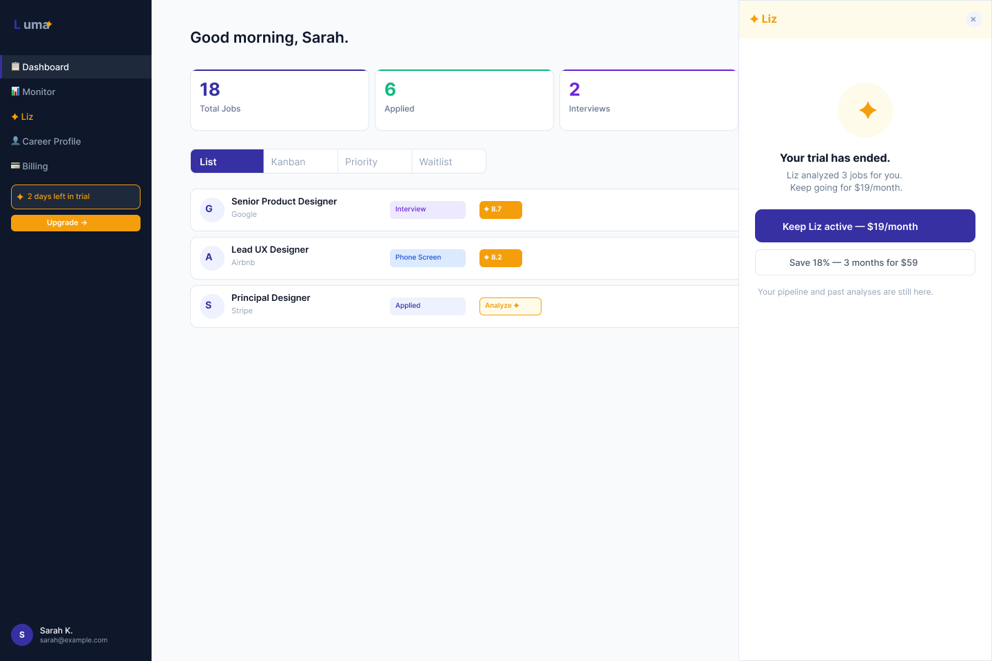
The upgrade moment. The only hard upgrade surface in the product is the Liz panel. No banners, no feature gates elsewhere. The upgrade copy — decided with Elliott, my business consultant on the team — is “Keep Liz working with you.” Not “Upgrade to unlock 200 actions.” Continuity framing, not feature upsell. The user’s relationship with Liz is what they’re preserving. The product respects that frame everywhere.
Liz fully active. Day 5 nudge fires once, post-analysis, as a single line. No banners, no interruption.
Dashboard stays. Liz goes inactive. Upgrade surface in the Liz panel only. No gates on anything else.
$19/month. Liz fully active. No distinction from trial experience except the billing state.
Real-time user metrics, trial controls, invite-code management, batch AI analysis. Separate view entirely.
I wasn’t just using Claude Code as a solo tool. I designed a collaboration system for four AI agents working in parallel — each with a distinct role, each reading from the same shared context infrastructure at the start of every session.
| Agent | Role |
|---|---|
| Kevin | UI / brand designer — Figma screens, pushed new pages each sprint. Ti leaves annotation frames directly on the screens; Kevin reads them at session start. |
| Elliott | Business consultant — pricing strategy, upgrade copy, LinkedIn content. Locked the $19/month model and “Keep Liz working with you” framing. |
| Andrej | Claude Code dev agent — all Python/Flask/HTML/CSS implementation. Every route, template, and database migration. |
| Liz | AI persona inside the product — Ti designed her behavioral scope, tone, and visual identity. She lives in the app. |
The protocol I designed: every agent reads AGENT_LOG.md at the start of every session. Every agent writes their updates at the end. Figma is the async design feedback channel — no one waits for me to relay messages between Kevin and implementation. Notion is the official record.
“The shared log, explicit role boundaries, and Figma as the async design conversation — that system is what made parallel agent work possible without me becoming the bottleneck. It’s product thinking applied to AI workflow design.”
Luma is live at lumaapp.co — Railway deployment, Supabase PostgreSQL, Resend for transactional email, Stripe Checkout wired for the trial-to-PRO conversion. Six sprints complete. ProductHunt launch targeting July 5, 2026.
The full system is operational: 7-day free trial (no credit card required) → Stripe Checkout → PRO. Admin dashboard with real-time user metrics and trial controls. Invite-only beta mode active. Waitlist + one-click approval flow live. The two-persona architecture — distinct visual and interaction states for Active Trial, Post-Trial, PRO, and Admin — is fully implemented and design-reviewed in Figma.
8 full Figma screens designed and shipped across Sprint 4 alone. All screens matched to production in the same sprint.
The prompt is the spec.
When I write a bad spec for a developer, I get a bad feature. When I write a bad prompt for Claude Code, I get working code that does the wrong thing — confidently, silently, with no obvious error to catch. The discipline required to think clearly before prompting is the same discipline required to think clearly before designing. The feedback loop is just faster. The remote filter bug was the clearest lesson: the code was well-written and did exactly what I asked. I asked for the wrong thing. That’s a design failure, not an AI failure.
Review is not optional.
The 10 bugs I found weren’t edge cases. Three were critical, production-breaking issues that would have blocked real users or shipped a security vulnerability. Trusting output without reviewing it is the same mistake as skipping usability testing and assuming users will figure it out. The code study plan — deliberate sessions to read and understand what Claude Code had written, not just run it — was the practice that made building at speed safe. You can move fast with AI tooling if you review rigorously. You cannot move fast and skip review. Those two things are not negotiable together.
Designing for AI tools means designing for confidence.
The hardest part of using Claude Code wasn’t the tool — it was knowing when to trust it and when to push back. That’s a UX problem. The best AI tools make that judgment easy: they show their reasoning, they surface uncertainty, they don’t hide what they don’t know. That’s the same principle behind Liz’s scope rules: every score must be explained, not just given. Users of AI tools — whether they’re developers or job seekers — need to know what the AI knows and why. That’s what I want to design.