UScellular Home Internet — From a Webpage Request to 129% Sales Growth
It Started as a Webpage Request. The Research Said That Was the Wrong Question.
UScellular had a home internet product. They also had a webpage for it. The page existed, it loaded, it described the service. But it wasn't selling. Visitors arrived, looked around, and left.
The initial ask was simple: make the page better. Better design, clearer copy, stronger call to action. The kind of brief that sounds scoped until you start asking why the page wasn't working in the first place.
Two weeks into research, it became clear that the page wasn't the problem. The problem was that nobody had mapped what a customer actually needed to know — in what order, with what level of specificity — before they were ready to buy home internet from a regional telecom they'd probably never considered before.
Home internet was a meaningful growth opportunity for UScellular — particularly in rural and suburban markets where the large national carriers had limited or unreliable coverage. The product was competitive. The market had real demand. But the company was losing potential customers at the research stage, before they ever got to a sales conversation.
A six-month engagement. A team of four. The scope reflected what leadership already understood: this wasn't a cosmetic problem, and a fast fix wasn't going to move the number.
I led UX design on a four-person Deloitte team — responsible for research, strategy, information architecture, and end-to-end design. The engagement ran six months. Research and strategy occupied the first half; design and iteration the second.
This project stands apart from my other Deloitte work in one important way: it was squarely consumer-facing. The research method was traditional B2C — screener surveys, moderated interviews with actual home internet shoppers, and journey mapping from awareness through purchase. Not stakeholder workshops with enterprise users, but real consumers explaining why they leave a webpage without buying.
Six months is long enough to actually understand a problem. I did not open a design tool until month three. That pacing was intentional, and it is a large part of why the outcome was what it was.
The research phase had three parts. First, stakeholder workshops with UScellular's marketing, product, and sales teams — to understand business goals, constraints, and what leadership believed was driving the drop-off. Second, customer interviews — people who had purchased home internet and people who had visited the page and left. Third, a competitive audit across AT&T, Verizon, T-Mobile, and local ISPs — to understand how the category was being sold online.
The customer interviews were the most valuable. What they revealed was a consistent decision journey: people shopping for home internet ask three questions, in order. First — is it available where I live? Second — will it actually be fast enough for what I need? Third — is it worth switching from what I have? The existing page answered none of these questions clearly, and answered them out of sequence.
That sequencing insight — three questions, one order — became the strategic frame for everything that followed.
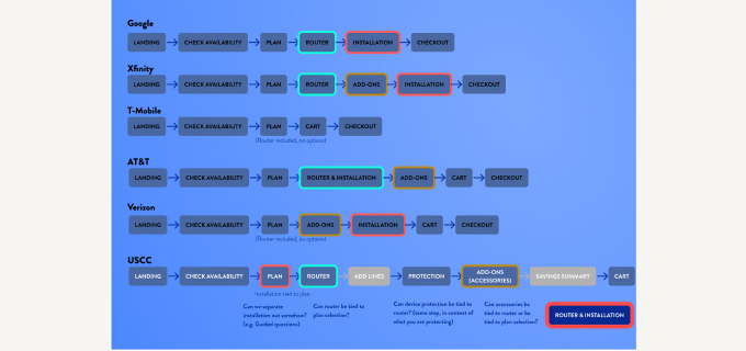 Competitive analysis — customer decision journey comparison across major carriers
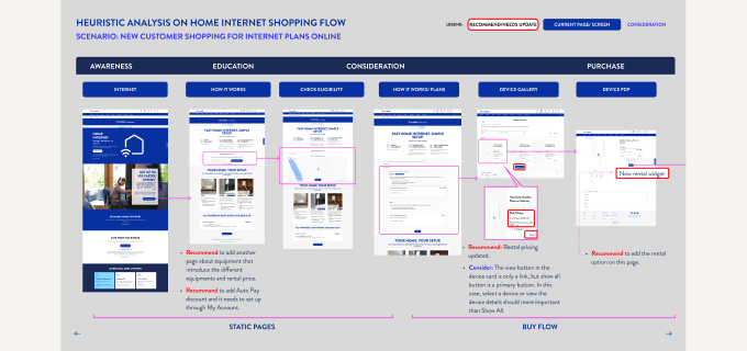 Heuristic analysis — UScellular home internet shopping flow with annotated UX recommendations
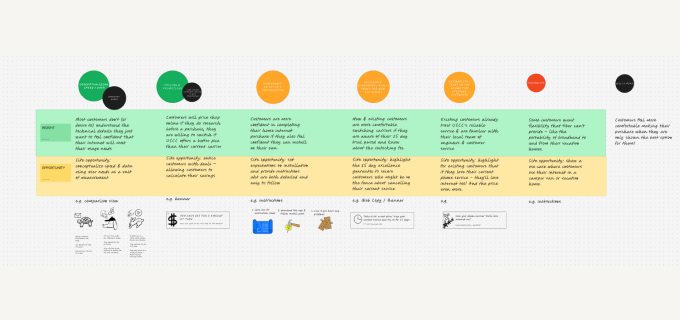 Affinity mapping — customer segment behaviors and design opportunities across buyer personas
The strategic reframe: this was not a webpage redesign. It was a customer decision journey redesign. Every page, every element, every interaction needed to map to one of those three questions — in sequence. Availability first. Performance second. Value third.
That sequencing became the information architecture for the entire experience — not just the landing page, but the availability checker flow, the plan comparison page, and the checkout entry points. We were designing a funnel, not a page.
We also made a recommendation that went beyond the original brief: position home internet as a primary product in UScellular's digital hierarchy, not a secondary one buried in the navigation. Leadership accepted it.
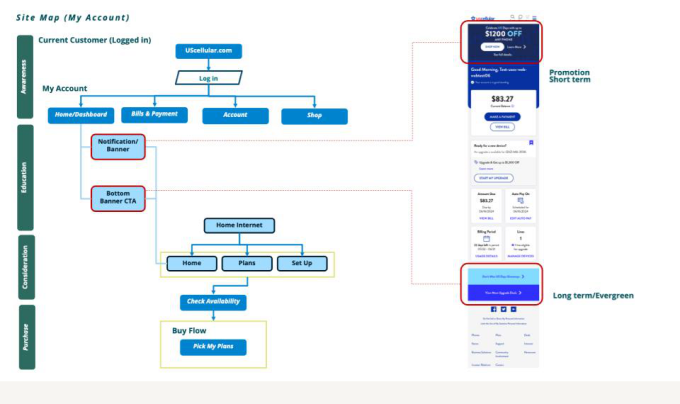 Site map — current customer path through uscellular.com with promotional entry points and availability-to-purchase flow
With the strategy clear, design was execution. The primary CTA became an availability check — not "Learn More," not "Get Started," but the specific action that answered the first question: "Check availability in your area." That single change removed the biggest friction point in the journey.
Plan comparison was redesigned around use cases rather than specs. Not "50 Mbps" but "good for streaming and video calls." Not "100 Mbps" but "works for the whole household, including gaming." The rural market UScellular was targeting did not need a speed comparison — they needed reassurance that this would work for how they lived.
The value proposition throughout spoke directly to the differentiated offer: reliable internet where the large carriers do not reach.
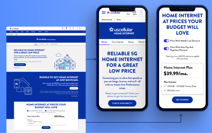 Landing page — desktop and mobile with “Check Availability” as primary CTA, answering the first customer question
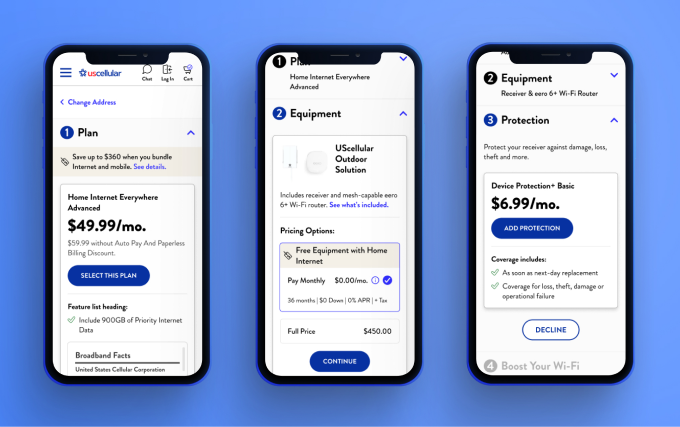 Checkout flow — Plan selection, equipment options, and device protection steps
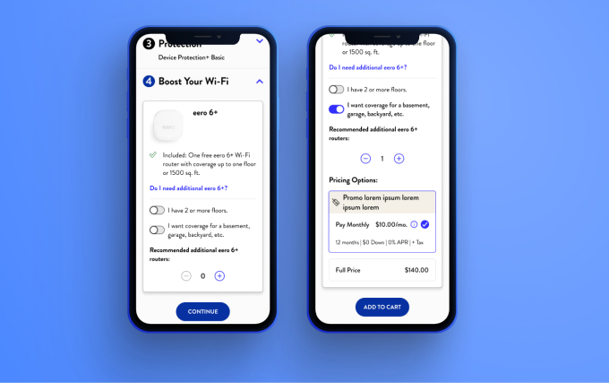 Checkout flow — Device Protection and Wi-Fi booster selection
Within six months of launch, online sales conversions for UScellular home internet increased 129%.
That number is the one I come back to when someone asks why I care about strategy as much as design. The page we built was not more beautiful than what was there before — it was more useful. It answered the right questions in the right order. And when people could answer those questions quickly, they bought.
"Make the page better" is almost never the real brief. The real brief is a behavior question — why are people leaving, what are they looking for, what is stopping them from acting.
The research phase on this project was not preliminary work before the real work. It was the most valuable work on the engagement. The design was the expression of the strategy. The strategy came from the research. Get the sequence wrong and you are just moving furniture.
This project was also a reminder of what rigorous, pre-AI design work looks like. No shortcuts. Just interviews, synthesis, frameworks, and decisions made one at a time, on the evidence. The outcome held because the foundation was solid.
“The page was not more beautiful than what was there before — it was more useful.”